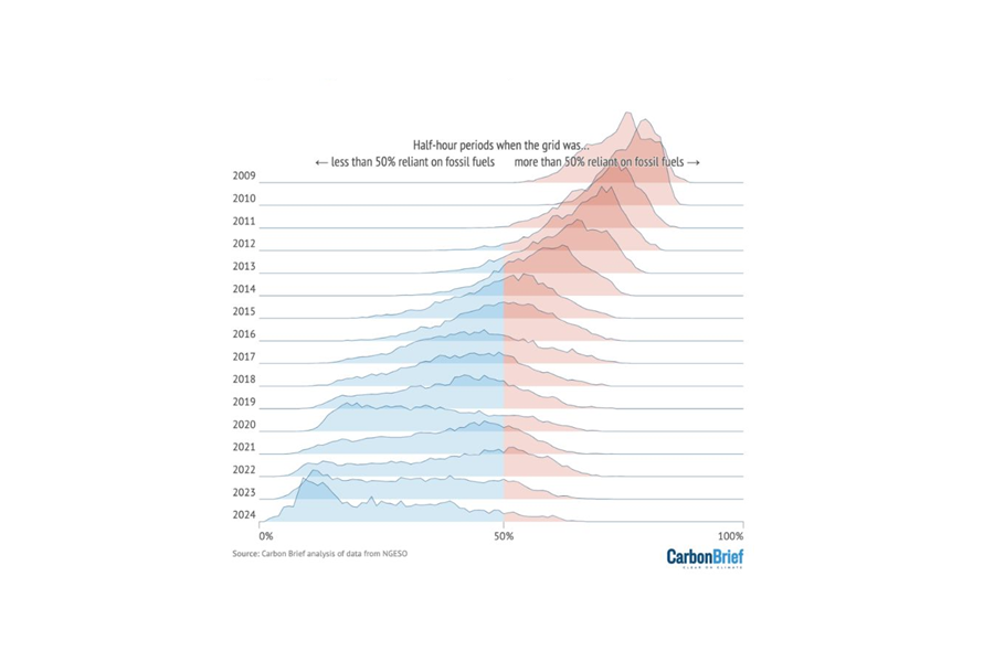
Britain’s journey away from fossil fuel based electricity is clear to see in this great new graphic from Carbon Brief.
For each year, the line shows the proportion of half-hour settlement intervals when fossil fuels supplied a given share of electricity. Over 50% and the line is red, under 50% and it’s blue.
Like a range of mountains stretching away into the distance, two things are clear:
1️⃣ The peaks are shifting to the left. We are seeing more intervals with a lower proportion of fossil fuels and, conversely, fewer intervals with a higher proportion of fossil fuels.
In 2009, every single half-hour interval was at least 50% reliant on fossil fuels. In 2024 so far, 92% of intervals have been less than 50% reliant on fossil fuels.
Put simply, generation from low carbon sources is increasing and fossil fuels are being called upon less often.
➡️ The lines are becoming flatter and less peaky. This is indicative of a greater spread in the proportion of fossil fuels across the year’s intervals.
So, while there are increasingly frequent periods with hardly any electricity coming from fossil fuels, there are still times when gas power remains essential for the GB grid.
In the UK, kike in many places around the world, I suspect gas capacity will be around for many years to come, but the number of hours it is needed each year will fall.
H/t to Simon Evans


